
Stirpad
Content Publishing

STIRpad is a simple effort to help creators share and demonstrate their new collections, galleries to talk about their new exhibitions and special projects, manufacturers and leading industry players to talk about their new designs and technology, designers to bring to light the collaborations, milestones and accolades they have recently merited. It is a meticulously curated platform for all innovators to show their NEW as they like it, cutting through the digital clutter.
STIRpad is a destination for professionals, young practitioners, enthusiasts, collectors, for all who are creating their new workplace or a new home, for learners, innovators, trendsetters and educators who seek what’s new in the creative world.
STIRpad is a launchpad for YOUR NEW.
Why?
We were entrusted with shaping the platform through in-depth research and thoughtful UX/UI design. Our work began by understanding user needs, mapping journeys, and identifying the gaps in existing digital experiences.
Through this research, we were able to define user personas, clarify their goals, and build a structure that addressed their diverse requirements with clarity and ease of access.
The UX/UI design process translated these insights into intuitive interfaces — streamlining navigation, simplifying interactions, and ensuring the platform felt both functional and inspiring.
This approach allowed us to create a digital environment that not only communicates the platform’s vision but also enhances user engagement and long-term usability.

Insights
-
There is a thriving work of creatives across the globe, both old and new, who are doing stellar work but there is no renowned space where they all come together to showcase their work.
-
There is a very deep camaraderie within this community but it gets lost due to lack of reinforcement and functional challenges.
-
A credible space where work of art creators to be viewed as a visual delight and to increase their reach is a major gap this industry is facing, especially new entrants.
Solution
-
Led by the ideology of STIR - Connect, Collaboration, Content and Community, The world of creatives need had to be brought together beyond geographical boundaries and disciplines
-
A sense of camaraderie STIRpad professionals know that they are with each other, even when they are not.
-
The second digital platform from the House of STIR after STIRworld.com - a global publication for the industry, it is a step forward from content curation to showcasing art creators and their stellar new and innovative work in one credible space.
Key Features - Curated Showcase
Covering the body of work that exists in this highly spread out and considerably deep sector in an easily navigable manner was done through clear categorisation in the main navigation.
Doing justice to the visual worthiness of the work of the creatives on the platform, large spaces were dedicated to imagery and images were carefully curated to showcase the best quality of each creatives work on the platform.

Key Features-Menu & Micro-interactions
Sub menus were carefully designed to cover all those on the platform in an equal manner in terms of real estate, space to showcase and hierarchy.
Microinteractions and visual delight was relied on heavily as an informed design choice to as to make the best use of the space allocated to each section while making sure no data was difficult to access in the process and that all stakeholders could create and have a great user experience on the website.
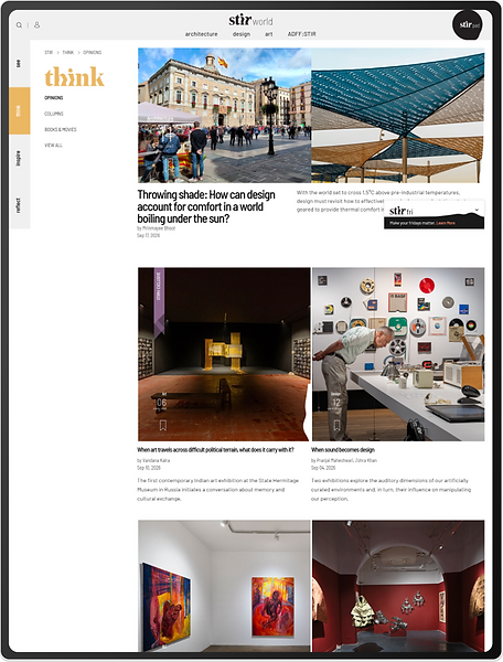
Key Features -Articles, Testimonials & New aggregations
Articles, testimonials and news aggregation was used to lend an added sense of seriousness, credibility and trust to the platforms image which was already a plus for STIRpad due to the reputation of The House Of STIR and the success of it’s first platform - www.STIRworld.com, which incidentally, our co-founder had done the research and designed the UX for back when she was an employee at Fractal Ink Design Studio - a fact that became a key point of advantage during her research and insight derivation from it for this platform and it’s design.

Key Features-Footer

The footer was used as the entry point to the brands own story (pages such as about us) and enable it’s engagement (contact and social media) so as to not take away from it primary purpose of aggregating the work of the community of artists it was supporting or steal the thunder from them in any way.